A Picture is Worth a Thousand Words
Visualize Your Data to Break Free from Status Quo Decisions
Where are our opportunities for growth? How could our services be more effectively delivered and processed? How is documentation a barrier to successful audits and timely reimbursement? Are our interventions effective? For whom? By applying visualizations to your data, you can approach these and other questions that are vital to your health as an organization.
The greatest value of a picture is when it forces us to notice what we never expected to see.” ~John Tukey
Data visualizations simplify the process of gleaning meaningful insights from the deluge of data that you are already collecting. They highlight important findings and reveal patterns and trends to help you make decisions that will take your organization to the next level.
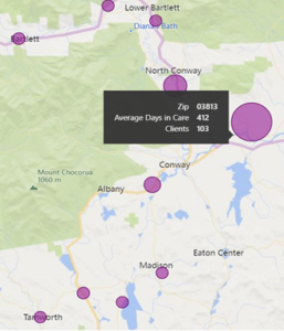
For example, the map to the right shows average days in care by zip code. Our eyes are drawn to the dots on the map, and we can quickly surmise that clients from Zip Code 03813 spend more time in care than clients from other zip codes.
Data visualizations help people process and interpret data in ways that would be difficult using spreadsheets and database queries.
Today’s environment compels agencies to show the value they bring for the services they are providing. Showcasing that value requires the ability to understand the quality of your data and to be able to use it to make informed decisions about your agency. Decision-making increasingly relies on data, and complex data is difficult for humans to process without visualizations. Visualizations help you make sense of your work, show your value to others, and make decisions about your organization.
What we actually do when we make a good chart is get at some truth and move people to feel it—to see what couldn’t be seen before. To change minds. To cause action.” ~Harvard Business Review
Using visualizations intentionally as a cornerstone for decisions may require you to change the way you approach decision-making. Instead of focusing on data in terms of what outcomes you are mandated to report, consider thinking about it from another perspective – what decisions are being made and what you need to know to make those decisions? From there, you can begin to truly use your data to change your work for the better.
Echo is committed to helping agencies make the best use of their data. We understand how data visualization can help agencies take their work to the next level. Echo’s approach to a data visualization system is strategic. We opted for straight-forward, user-friendly dashboards paired with the ability to dig as far into details as you’d like. Users can drill down to examine data at all levels of granularity, even to the base data that used to create the visualization. We’ve gone beyond static bar, line, and pie charts, to provide cutting-edge interactive graphical depictions of your data that are still simple to understand. This allows our partner agencies to extract meaning more quickly and easily, exposing patterns and trends that might otherwise have gone undetected. Our commitment to data usage doesn’t stop there. Whether you want to better understand the accuracy of your data, want custom dashboards, or want to predict outcomes for your clients, Echo is here to guide you through best practices for revealing the health of your data, your organization, and your clients.
For more information, please see a recent webinar discussing the value of data visualization, From Reactive to Proactive CQI.